There are marketing experts who will argue the advent of advertising dates back to 4000 BCE. It was the Babylonians who introduced the first known forms – store signs, town criers, ‘sponsorships’ and the like. It would appear that branding has come a very long way. The dawn of a third age The American Marketing Association (AMA) ushered in its 75th year in 2012, and with it, declared the ‘third age of branding.’ The AMA suggests the new age is defined by “how people experience the brands and ads around them.” As opposed to the first age, in which branding was based on an “appreciation of product function and innovation.” In the second age, focus transitioned to a valuing of “emotional utility and image.” Today, the AMA suggests, brands are “multi-dimensional, interactive, alive.” Throughout all of this perceived change, one thing has remained the same – logo logic.
The Logo Remains
The logic behind the logo – the relatively small icon that embodies the values, ethics, traits, and perception of an entire organization – has, for the most part, remained unchanged. Logos are the most visible part of a company, the brand marque, seal of authentication and quality assurance. Designer Lindon Leader, creator of the acclaimed FedEx logo has been designing for more than 30 years. The leader was unfazed by the dawn of the new age. His logo logic has always been the same. When designing a logo, whether for Disney or a Park City library, Leader consistently strives for two things: simplicity and clarity. In an interview with Matthew May, in “The Story Behind the Famous FedEx Logo and Why it Works,” Leader reiterates, “great design is born of these two things what we all want from logo design, from business, from our work, even from our friendships.” The ‘law of subtraction’ May, a designer and author in his own right, lives and works by similar rules. In his 2013 book, The Laws of Subtraction: 6 Simple Rules to Living in the Age of Everything, May contends that, in this, an age of excess, success demands subtraction. He defines subtraction as “the art of removing anything excessive, confusing, wasteful, unnatural, hazardous, hard to use, or ugly… or the discipline to refrain from adding in the first place.” So, the lesson in all of this? An age-old adage sums it up; Keep it simple, stupid.
The Perfect Blend

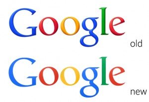
Keeping in mind the AMA’s rules for the future of branding, Lindon’s advice and May’s law, one name – and conveniently, one logo – come to mind: Google. In an article titled, The role of the logo in the third age of branding, (2013) author Tim Hill argues the brand name has come to “evoke connotations of not just a product, but an entire way of thinking, innovation, creativity, and employment in recent years.” Hill is correct; Google has come to stand for all of the aforementioned, and more. However, Hill further contends that the logo has changed and developed with the company. In fact, the six multi-colored, Catull BQ font face letters, have – since the company’s 1998 prelaunch – have, you guessed it, fundamentally stayed the same. Rather than changing their central marque, Google came up with a wonderfully creative alternative, characteristic of the third age of branding. Google Doodles – the illustrations surrounding the logo on the search engine main-page that commemorate events, historic dates, birthdays and various other dates – are perfectly “multi-dimensional, interactive, alive.” Virtually everything about Google has changed, developed, become bigger and more complex since it’s inception, everything except for its logo.

Country Cradles Logo. Designed by Natalia Solodukha, Graphic Designer @HQDesign Keeping it Simple @HQ The stunning design by Natalia Solodukha, designer at HQDesign, for Country Cradles is a perfect example of simplicity and clarity applied. Solodukha expertly crafted the cradle shape using the first two letters of the company name.

Founder
Hey! Welcome to our blog!
The topics we cover include IoT, AR/VR, related news, and our projects.If you’d
like to discuss an article, please
messsage
me on LinkedIn
We are open to seeing your business needs and determining the best solution. Complete this form, and receive a free personalized proposal from your dedicated manager.

Sergei Vardomatski
Founder


